Good morning, folks!
The other day I sat through some AI training. For today’s Editor’s Corner, I’d like to share a couple of things I learned about: heat maps and histograms.
I know, those sound more like something the doctor ordered, but to those out there who are familiar with managing data, they are likely common terms. Let’s have a look at what they are.
From TechTarget:
A heat map is a two-dimensional representation of data in which various values are represented by colors. A simple heat map provides an immediate visual summary of information across two axes, allowing users to quickly grasp the most important or relevant data points. More elaborate heat maps allow the viewer to understand complex data sets.
Maybe a better way to explain is to give you an example. Here’s something I pulled up in an internet search for “heat map.” It’s very generic with the “team members” and undefined skills, but the idea is to get information from the colors. I put a black outline around two different rows to give you an idea of what you can deduce from the colors and a little information.
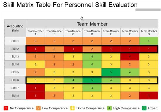
For example, I’m exploring this data to decide what kind of training the team needs.
- Looking at Skill 2 and the red in that row, you can see that many team members are deficient in Skill 2. Skill 2 might be a good candidate to focus on and teach.
- Looking at Skill 6, you can see that all team members have some competence with knife handling…I mean Skill 6…all the way up to being an expert at that skill. Skill 6 might be a talent that can be put at the bottom of the list for teaching.
The heat map is used for many different types of data analyses, and as you can see, it is pretty easy to make deductions using it.
And now for histograms.
We are all familiar with histograms, I just didn’t recognize the word. Apparently “histo-“ means “upright” or “tissue” in medicine. “Gram” is Greek for something written. I think the “tissue” definition is throwing me off.
From Merriam-Webster:
histogram: a representation of a frequency distribution by means of rectangles whose widths represent class intervals and whose areas are proportional to the corresponding frequencies
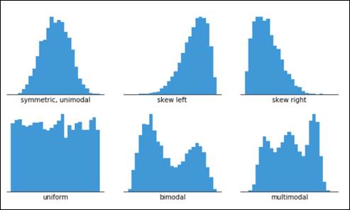
Ugh, what a wordy definition! How about this instead? A “graph that shows the distribution of data.” Even better, a screen capture, showing six common types of histograms:
So, welcome to my AI training. I don’t think graphs were the intended target of my learning, but that’s what I got out of it. Enjoy!
Kara Church | Technical Editor, Advisory | Technical Publications
Pronouns: she/her | Call via Teams | jackhenry.com
Editor’s Corner Archives: https://episystechpubs.com/

Leave a comment